.png?width=1200&height=344&name=cover%20(7).png)

In this article
Around 83% of customers say they’re willing to refer a friend after a good experience. Only about 29% actually go through with it. That gap, between intent and action, is where most referral programmes lose their growth potential. The bridge across it is your referral programme call to action. We’ll break down the copy, placement, and design choices that move users from “I’d happily share” to actually sharing, with data from brands like Dropbox, Airbnb, Revolut, and NatureBox.
What Is a Referral Call-to-Action? (And Why It Is More Than a Button)
A referral programme call to action is any prompt that asks an existing customer to recommend your brand to someone they know. Most people picture a single referral button, but the CTA system is broader than that.
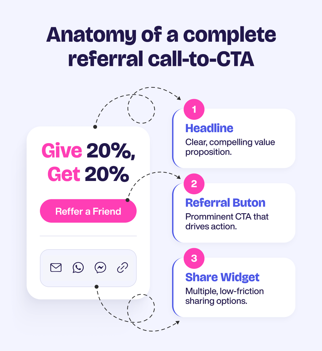
A complete referral CTA usually has three parts:
- The referral button itself (“Get £20”, “Refer a friend”)
- The headline above it (“Give £20, get £20”)
- The share widget that opens after the click (email, WhatsApp, copy link)
This is structurally different from a generic social share button. A social button posts your content to a feed. A referral CTA is built around incentives, attribution, and conversion. The infrastructure tracks who shared, who clicked, and who converted, so you can attribute every sale.
Why 2026 context matters: paid acquisition costs keep climbing, privacy changes have made attribution harder, and trust in online ads has fallen further. A well-designed referral programme call to action sits at the intersection of all three problems. It’s privacy-friendly, performance-based, and built on trust by default.
Why Some Referral CTAs Get Clicks, and Others Get Ignored
Three psychological levers do most of the work in a high-converting CTA:
- Reciprocity. When a customer gets value from your product, they’re primed to give something back, including a recommendation.
- Social proof. 92% of consumers trust recommendations from friends over any form of advertising.
- Reward expectation. Around 74% of consumers say they wouldn’t refer a brand without some kind of reward.
People want to share. But friction, vague language, or a missing reward kill the impulse before they click. A good refer-a-friend button removes friction. A great one frames the share as a personal win, not a chore.
Referral CTA Copy That Actually Converts (With Data)
The single biggest factor in referral conversion isn’t design or colour. It’s copy. Here are five tactics that move the needle, each with a data point, a named example, and a takeaway.
1. Lead with the reward, not the action
The strongest referral CTAs make the benefit obvious before the user has to think. Instead of asking people to “Invite friends” or “Refer a friend”, lead with what they actually get from taking action.
A button like “Get £20” or “Get £20 for every friend” does more work than a generic referral prompt because it answers the user’s first question immediately: what’s in it for me? NatureBox proved this with a simple CTA change, replacing a standard referral button with “Get $10 for Free!”. The result was a 48.7% share rate.
The takeaway is simple: put the reward on the button. “Get £20” is clearer, faster and more motivating than “Tell a friend”.
2. Make the CTA feel personal
Small wording changes can make a referral CTA feel more owned by the user. One of the simplest tests is switching from second-person language to first-person language.
For example, “Get your free trial” sounds like a brand instruction. “Get my free trial” feels more like the user is choosing it for themselves. ContentVerve’s well-known test found that this kind of first-person framing increased clicks by 90%.
For referral campaigns, this could mean testing “Get my £20” against “Get your £20”. The offer stays the same, but the framing changes how the action feels. Run the test for long enough to get reliable data, ideally at least two weeks, before deciding which version wins.
3. Use a clear give/get structure
Referral CTAs work better when the value is balanced for both sides. A strong give/get structure shows the referrer that they are not just earning something for themselves — they are also giving their friend a real benefit.
That is why copy like “Give £20, get £20” often feels stronger than a one-sided message. It makes the act of sharing feel generous rather than purely transactional. Industry data suggests that give/get CTAs can improve conversion and customer lifetime value by around 31% compared with give-only structures.
The best approach is usually to lead with the friend’s reward first, then reinforce the referrer’s benefit after the action. For example, the CTA might say “Give £20, get £20”, while the confirmation screen reminds the user: “You’ll get £20 when your friend makes their first purchase.”
4. Be specific about the value
Vague CTA copy creates unnecessary friction. Words like “rewards”, “credit” or “bonus” can work in supporting copy, but they are usually too soft for the main button. The user still has to stop and figure out what the reward actually means.
Specific numbers remove that effort. “Get £20” is instantly clear. “Earn rewards” is not. The more precise the CTA, the easier it is for the user to understand the value and take action.
If the reward changes by market, tier or customer segment, the CTA should update dynamically. A customer in the UK should see the correct £ amount. A customer in another market should see the relevant local value. The user should never have to guess what they are being offered.
5. Use urgency only when it is real
Urgency can make a referral CTA more effective, but only when there is a genuine reason to act now. A temporary reward boost, seasonal campaign or short-term multiplier gives users a clear reason not to leave the action for later.
For example, “Get £75 for the next 14 days only” combines a specific reward with a clear deadline. The value is easy to understand, and the time limit gives the offer momentum.
The important part is honesty. Fake countdowns and permanent “limited-time” messages quickly lose their effect. Once users realise the urgency is artificial, it stops driving action and starts damaging trust. Use urgency when the promotion is genuinely time-bound, and let the baseline reward carry the CTA the rest of the time.
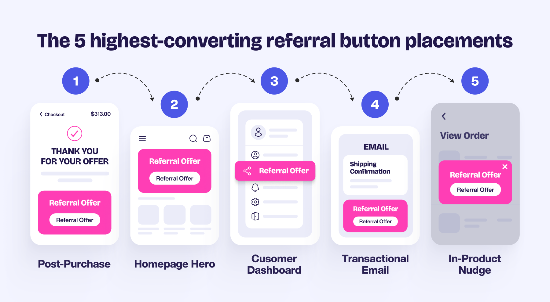
Where to Place Your Referral Button (5 High-Yield Positions)
Copy matters most. Placement is a close second. These are the five positions that consistently outperform.
|
Position |
Performance lift |
Approx. share of referral revenue |
|
Post-purchase page |
16x more shares |
24% |
|
Homepage hero |
300% more likely to share |
46% |
|
Account / dashboard |
10% share rate |
36% |
|
Transactional emails |
70 to 90% open rates |
Varies |
|
In-product contextual nudges |
4x more refers |
Varies |
1. Post-Purchase Page
The moment immediately after checkout is the single highest-intent point in the customer journey. Customers see 16x more shares from post-purchase placements, contributing around 24% of referral revenue. They’ve just chosen to trust you. Ask them to share before that energy fades.
2. Homepage Hero
Visitors who land on a homepage with a visible referral offer are 300% more likely to share over their lifetime, and homepage placements drive close to 46% of referral revenue when done well. The catch: it has to be above the fold, not buried in the footer.
3. Account / Dashboard Page
Logged-in users are your most engaged audience. Dashboard placements typically see a 10% share rate and contribute around 36% of referral revenue. Pair the refer-a-friend button with a usage milestone (“You’ve saved 10 hours this month, share with a friend”) for an extra lift.
4. Transactional Emails
Order confirmations, shipping updates, and onboarding emails see open rates of 70 to 90%. That’s far higher than any marketing email you’ll send. Add a small referral block at the bottom so it captures attention without disrupting the primary message.
5. In-Product Contextual Nudges
Dropbox’s “almost out of storage” prompt is the gold standard here. Users are 4x more likely to refer from the same page they’re on than from a redirect. Make the share happen where the user already is, not three clicks away.
Mobile vs. Desktop: Why the Refer-a-Friend Button Needs to Be Different
Around 65% of referrals now come from mobile messaging apps. That changes how the refer-a-friend button needs to behave compared to its desktop counterpart.
On mobile, prioritise:
- Native share sheet (one tap to WhatsApp, iMessage, SMS)
- Floating action buttons on key pages
- One-tap copy link
- Touch targets of at least 44px
On desktop, prioritise:
- Email and social sharing options
- Personalised URL display
- Larger reward visualisation and supporting copy
Airbnb’s mobile referral redesign reportedly delivered around 300% more bookings, driven mostly by simpler share flows and native messaging integration. Use the same copy across both screens. Never the same UI.
Referral CTA Examples From Brands That Got It Right
|
Brand |
What they do well |
Tactic in play |
|
Dropbox |
In-product contextual prompts at the moment of need ("almost out of space"), with clear give/get framing |
Placement + give/get |
|
Airbnb |
Mobile-first design, localised reward amounts, personalised messaging across markets |
Mobile UX + specificity |
|
Revolut |
Specific monetary rewards (£10, £25, £75) with time-limited boost campaigns |
Specificity + urgency |
|
MeUndies |
Bold reward-first copy ("Get $20, give $20") with imagery that matches the brand's playful tone |
Reward-first + give/get |
What connects all four: they lead with the reward, frame the share as mutual, and place the CTA where intent is already high.
How to A/B Test Your Referral Programme Call to Action
Most teams over-test design and under-test copy on their referral programme call to action. Reverse that order.
Test Copy First, Then Placement, Then Design
Copy changes deliver the biggest lifts. Run a copy test for at least two weeks before touching the button colour or icon.
Reach Statistical Significance Before Declaring a Winner
A 10% lift after three days is usually noise. For most referral programmes, aim for 200 to 300 conversions per variant minimum before calling it.
Learn From Counterintuitive Results
Mention Me’s work with Boux Avenue found that giving customers more sharing options (not fewer) outperformed the simpler version. Conventional UX wisdom says “reduce choice”, but referral behaviour broke the rule here. The lesson: test, don’t assume.
Beyond the Button: Name Share and the Future of Referral CTAs
Most referral programmes only track digital shares. But a huge proportion of word-of-mouth happens offline. Someone tells a colleague about your product in person. The colleague Googles it later, buys directly, and the referrer never sees credit.
Mention Me’s Name Share lets new customers enter the referrer’s name at checkout. The referral gets attributed even when no link was shared. Brands using Name Share typically see referral volumes increase by around 30%.
The next generation of the referral programme call to action won’t be a single button. It will be a system that captures every kind of recommendation, including the ones that happen in conversation.
|
Want to see what this could look like for your brand? Explore the Mention Me referral platform to see how Name Share and built-in CTA testing work together, or learn more about our referral marketing software. |
Conclusion
A referral programme call to action is a small piece of UI doing a big job. It converts intent into action, action into a tracked share, and a share into measurable revenue.
The brands that win at referral don’t have prettier buttons. They have clearer copy, smarter placement, and a willingness to test what conventional wisdom says shouldn’t work. Start with the copy. Place it where intent is highest. Then test everything.
FAQ
What is a referral programme call to action?
A referral programme call to action is the prompt that asks an existing customer to recommend your brand to a friend. It usually includes a button, a headline that frames the reward, and a share widget that opens email, WhatsApp, or social options. The strongest CTAs lead with a specific reward, use first-person language, and sit where customer intent is already high.
What should a refer-a-friend button say?
A high-converting refer-a-friend button leads with the reward, uses first-person framing, and signals the give/get structure. Strong examples include “Get my £20”, “Give £20, get £20”, and “Get £10 for free”. Avoid vague language like “Invite friends” or “Tell a friend” with no reward in sight. Specificity beats cleverness almost every time.
Where is the best place to put a referral button?
The highest-performing placements are the post-purchase page (around 16x more shares), the homepage hero (300% more likely to share, around 46% of referral revenue), and the account or dashboard page (around 36% of referral revenue). Pair these with transactional emails and in-product contextual nudges to capture every high-intent moment in the customer journey.
Dan Barraclough
Read more >
Share:


.png)
Share:

.png)
.png)